
Quick links
- Background
- Installation
- Touch friendliness
- Interface scaling
- Media
- Battery life
- Resource consumption
- Conclusion
Background
Let’s start the comparison from the preinstalled default and the most closed system of them all: Windows 10 Pro. In a way it is also a benchmark of the current status of what one can expect a mobile-friendly OS to be like, since it is based on Windows 8 that was all optimised for tablets. However, most changes between the two versions were in fact made to bring back PC-centric features, such as the start menu; so how usable is it, really?
For reference, the tablet came preinstalled with Windows 10 Anniversary Update and preloaded with a few HP apps (surprisingly few at that). One of the first things you see is a screen asking you to register the product. I haven’t really seen a need for that. The first thing I did was create recovery media just in case; the manual suggested using the HP support app to do it, which I did… and it turns out that it just opens the Windows 10 recovery media creation tool. How useful… Speaking of “useful” apps, another preinstalled one is the Energy Star app, that seems to add a tray icon with a link to power options and the Energy Star website.
One of the other first things I did was check what the tablet’s specs are. This version of HP x2 210 comes with 4 GiB RAM and 64 GiB eMMC card which is used as internal storage. The manual also notes that some versions come with a disk in the keyboard; not mine, but the SATA connector might still be there, so I might want to try and see if I can connect it. For reference, an SD card (subset of MMC) is about 10 times faster than a rotational drive, but about 10 times slower than an SSD. I might want to do some benchmarking on that sort of thing later on as well. The starting partitions are about what you can expect: an EFI system partition (260 MiB), “Microsoft reserved” (read: Windows boot; 16 MiB), WinRE (last, 979 MiB) and the actual Windows partition (rest of the eMMC). Oddly enough, as I found out later, the Windows partition is of the “bitlocker” type.
I also noted that the tablet has a resolution of 1280x800, which is 16:10. This, at 10.1 inches, means that the DPI of the device is 144, which is 150% of the industry standard of 96 DPI. (My old tablet was exactly the same.) That makes it HiDPI.
Now, one thing I realised is that at this day and age, with the new rolling release strategy, bundling a device with Windows 10 makes about as much sense as bundling it with a non-LTS Ubuntu version; in other words, it’s outdated on arrival and nobody will ever really run it. As such, the only reason to do that is if your device doesn’t have internet connectivity (but in that case there isn’t a whole lot you can do with it), and to actually activate the Windows license. I did that and immediately reformatted the whole eMMC, so that I could install a clean Windows 10 Creators Update, and also so that I could compare all the OSs fairly.
Installation
The installation process of Windows 10 has changed surprisingly little since Windows 7 times. The first inconvenience was right there on the language select screen: turns out that there are no touchscreen drivers for my device in the Windows 10 install media! The screen was also distorted due to it using a generic VESA driver rather than one for the Intel inttegrated graphics. Thankfully, the keyboard that the tablet is equipped with was the saviour here, as it allowed to navigate through the install process. However, if I didn’t have one, I’d be stuck, so this is a usability concern. After I went through the setup and the tablet rebooted a few times, I was able to use the touchscreen, which is rather odd because I don’t think I connected to the internet at that point.
The first part of the installation where files are being copied to the internal storage is not very touch-friendly. Options are presented in a rather tiny Windows 7-style window, without scaling options. Once that is done, installation continues in a much more touch-friendly OOBE environment, where one needs to select users, privacy options (hint: select the exact opposite of the “quick defaults”), etc. Firstly one is prompted to connect to wifi… except there are no wifi drivers for the Intel wireless card, so the list is empty! The user setup is also rather silly, because it creates a single administrator user and you have no choice on that, despite a standard user being the recommended option (like on UNIX-style systems). After installation, another user can be created which can then be set to be standard, but this process is even more silly: you have to choose to add another “family member”, then tell the new user creation tool that you don’t know their contact details (!), then tell it that you do not want to create a Microsoft account for them (both options are tiny at the bottom left), and then you finally get to the username and password entry part.
After installation, Windows Update automatically pulls in all of the necessary drivers without the HP addon cruft. That’s quite handy and a very nice improvement over Windows 7 times of scouring the OEM’s website for drivers (though you can still do it to get the HP addons if you like).
Touch friendliness
Windows 10 boasts a feature called Tablet Mode. This is a freely toggleable setting, and when activated, it does three things:
- sets the Start button to bring you to the Start screen from Windows 8;
- makes all apps start up fullscreen, whenever possible;
- adds a “back” button to the taskbar.
Optionally, it also deactivates the program icons on the taskbar, presumably because you can get a list of programs (and close them) by swiping from the left. But I find it quicker to use the taskbar icons for that anyway; that saves a swipe for a task that is quite often performed. The most impactful change this setting does is activation of the Start screen; I don’t mind much whether apps are fullscreen or not, and I have never used the back button. So for practical purposes, you can think of Tablet Mode as a Start paradigm switcher.
Now, when I attach the keyboard, Windows 10 suggests disabling Tablet Mode, and can be set to do that automatically. That sounds pretty smart… on paper. In reality, it’s actually a very bad idea. The main reason why the Start screen is better suited for tablets than the Start menu is item size: you can’t really use finger input for pressing buttons in the Start menu. When the keyboard is attached… nothing changes in that regard! You would want to disable Tablet Mode when a mouse is attached instead. A stylus might also be precise enough for the Start menu to be more useful than the Start screen. So in fact I had to tell Windows 10 to stop trying to be smart and keep Tablet Mode on at all times.
Now, the Start screen itself is an interesting beast. It originated in Windows 8 as a sort of Start menu and desktop replacement. It consists of a bunch of live tiles arranged in a somewhat irregular grid. Each live tile is associated with an app, and is able to display something dynamically. For instance, a weather live tile would be able to display the current weather, and would bring you to the weather app when pressed. So live tiles are basically a cross between desktop icons and desktop widgets. That’s an interesting idea, but once again, on paper. In reality, it seems that only “modern apps” (read: tablet apps that you can get from MS store) can make use of the live component of the tiles, and those tend to be lacking in features. Perhaps due to the fact that live tiles are tied to apps: if you want to make a waether widget, you have to also have a weather app, which might just be the same widget just fullscreen. And the default set of live tiles doesn’t help sell it: it’s an obnoxious pandemonium of chaos. Instead of using the live aspect to do useful things, a lot of the default apps use it for animation: cubes spinning to present random news, and worse, advertise games. That’s two things that you don’t want at all! Animations attract your eye and should only be used for very important things like notifications, not to show off. And the last thing you want in an operating system (that’s paid, no less) is advertisements.
Modern apps themselves are also an interesting beast. Some you can “uninstall”, some you can’t. There doesn’t seem to be any rhyme or reason as to which or why. For instance, you can “uninstall” the news app, but not the Xbox app, even if you don’t play games altogeter. I write “uninstall”, because Modern apps, unlike actual programs, are not system-wide, but rather per-user. You can uninstall an app from one user, which frees up system resources (yay!), but it still takes up space and is automatically installed upon creation of a new user (boo!). There is also no configuration while installing the OS as to which apps you want and which you don’t. I also ran into an odd bug where all the apps I uninstalled one day got reinstalled for no rhyme or reason.
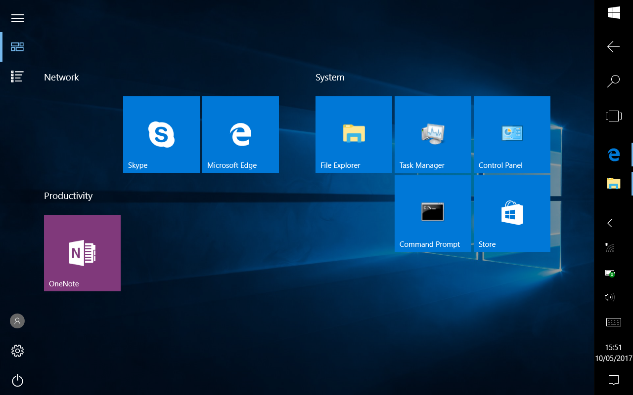
So, for me the start screen boils down to just a touch-friendly version of the desktop. I remove all default app tiles and put in those that I need; mostly those are desktop programs, like the Control Panel (which still exists alongside the Settings Modern app for some reason) and Task Manager. I turn off the tile liveness, make sure that all tiles are of the same size (why would one ever use anything other than medium size!), and use it for one-touch starting of apps. I never had so many tiles that I would need to scroll the start screen, but it has a list of all installed apps that’s scrollable using touch, wich is a nice, well, touch.
Whether an app is touch-friendly or not depends almost exclusively on whether it’s a desktop or Modern app. Navigating the Device Manager with touch is a nightmare, but Settings are pretty well-done for it (while feeling alien on PCs). That said, Settings and Edge are pretty much the only Modern apps I actually use. Edge is interesting in that it is a decent desktop browser as well, it doesn’t feel that much out of place compared to Settings.
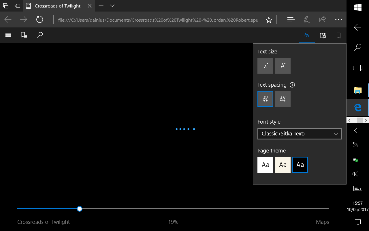
Speaking of Edge, I was pleasantly surprised to see that it could open an ebook in the EPUB format, so I could read it while flying. It even has an ebook reading interface, with the ability to change colours and font size. However, it’s also buggy: I could flip pages up to the 10th page, after which Edge would just infinitely show the loading animation. I had to use the reading progress slider to select pages instead, and with over 100 pages, that meant moving the slider by 1 pixel and hoping the right page would appear. That’s just terrible, but probably will get patched later on.
Interface scaling
Windows 10 includes a slider for changing the UI scaling globally. Though it actually only looks like a slider; it’s a checkbox in disguise, because the only two options available are 100% and 125% scaling. That’s not actually enough to get to the needed 150% scaling! I know that Windows 10 can scale that much, but apparently it requires more pixels (probably some elements can’t fit on screen at 150% scaling).
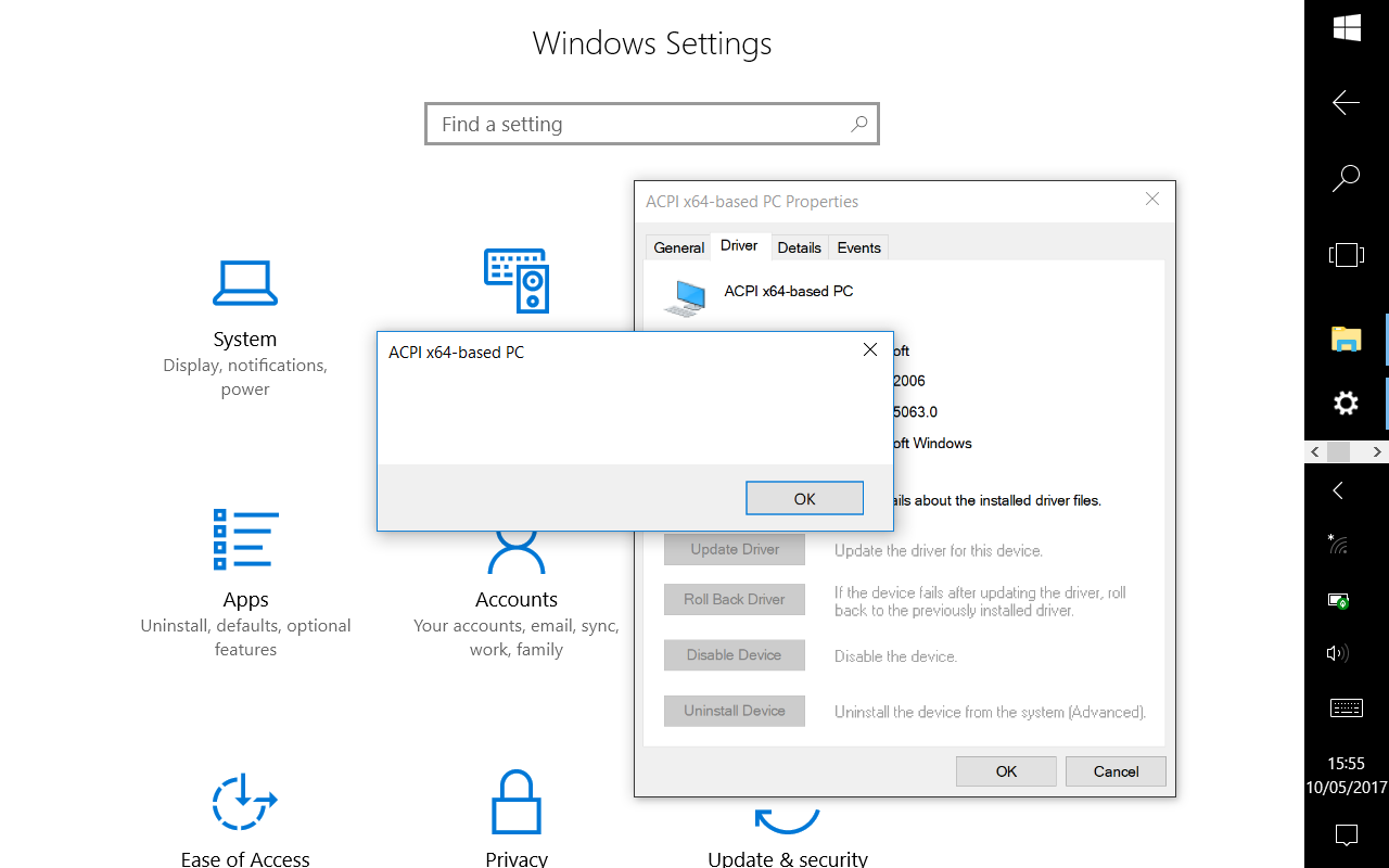
The effects of the scaling also vary by program. Modern apps work quite nicely. Old apps like the aforementioned Device Manager don’t scale well at all: the text is scaled up using bilinear scaling rather than using a larger font, so the text looks fuzzy and unclear.
Media
The Intel drivers seem to provide hardware acceleration, since Edge can display at least 720p videos from YouTube (without Flash installed) without a single dropped frame. A much needed improvement over the old tablet!
I haven’t checked VLC performance just yet.
Battery life
Seemingly the battery life is shorter than for my old tablet (but that is to be expected, since it has a less capable yet lighter battery). Windows estimates around 6 hours for regular use and 8 hours for light use.
Resource consumption
A vanilla Windows 10 Pro 64-bit takes up 1.2 GiB RAM out of the 4 GiB available (101 MiB hardware reserved, 345 MiB cached). That would be really pushing the envelope of the 2 GiB RAM version of this tablet. Task Manager points out that memory compression is in effect.
From the disk space point of view, after disk cleanup it takes up 15.8 GiB space. Note that this is a fairly vanilla install: no office programs are installed, not even Windows Journal. With that in mind, it’s quite heavy on space, considering that the eMMC space is quite limited, and that other OSs fit into 8 GiB easily.
The boot time of the fairly vanilla Windows 10 install, with Hybrid Boot disabled (this feature, enabled by default, makes Windows no longer ever really shut down, but rather always hibernate and resume), is 6 seconds to show the login screen, and 6 more seconds to show the start screen after login. The Windows boot loader also takes some time to start by itself, and Windows reports that it takes 2.7 seconds for UEFI itself to start the hardware. All in all it’s a pretty good result.
Conclusion
The good:
- Core OS is fairly touch-friendly, Start screen
- All hardware works as intended after a Windows Update
- Good performance, no laggy animations or video
- Edge doubles as an ebook reader
The bad:
- Installation has no touch drivers
- Scaling only up to 125% and spotty at times
- Touch-friendliness depends on the app, most are not very touch-friendly
The ugly:
- Spyware and adware by design
- Completely closed-source