Blossom mutator for Unreal Tournament 3 is one of those things that you just have to install to the game just after you install it from the DVD, along with all the patches, bonus packs and MapMixer. Without this mutator, the game is simply not finished. Why, you would ask? Because of the Bloom effects used in the game. First of all, let me explain how Bloom in UT3 works in the first place.
Textures in Unreal Tournament 3 support a special texture type called "Emissive material". They define how each texture is subject to Bloom. However, that is merely a guideline - the actual bloom settings depend on the map, more specifically - on the zones or volumes in the map. Level designers can choose to change the Bloom settings in each zone as they see fit. This is especially important for things like water zones, where Bloom settings are increased in order to make the view blurry so you would feel like being underwater and not just floating in the air somewhere.
The problem here is that the settings chosen do not match the reality. For some reason, all maps have ludicrous settings. In reality, you could only see the world like that if you were filming it through a smudged camera. However, Unreal Tournament 3 is a First Person Shooter; emphasis on First Person. Your eyes are completely different from video cameras. They are more complex and they don't or nearly don't see light bleeding (which is called Bloom in video games) - unlike cameras. And they can't be smudged, since there are cleaning mechanisms that prevent that (and, you know, you wouldn't be able to see much!). However, it is still realistic, because even though our eyes are a lot more sophisticated than cameras, we are still affected by light diffraction - light tends to go around small objects, much like physical waves. You can notice that when you look right at a street lamp - you see what is called a corona, sort of a halo that is around the light source because of light diffraction. That's why Bloom is useful - it dynamically creates coronas for you so the game looks realistic. In earlier games, coronas were static and level designers had to place them on the light sources, but with materials that pan, rotate and oscillate you simply can't use that any more. Thus Bloom is in fact realistic, but not the amount of it that is originally in the game.
A similar thing is with Depth of Field, blurring things around a focused object. It does happen with both eyes and cameras, however, there is one difference - when you play back a film from a camera, your view is not locked to the centre. Instead, you can look at anything you wish. When you use your eyes, however, you only see the focused part at all times. There is peripheral vision, but it shouldn't matter in a fast video game. Lastly, there is Desaturation. It's global and it removes colour from the game. You can affect it with the post-processing options (set it to Vivid to tone it down a little). Why the designers decided that it was a good idea is beyond me - real life is a lot more colourful than stock UT3.
Normally in order to combat this people are content with simply disabling Bloom and Depth of Field. However, that is also not ideal. Disabling it means disabling all of post-processing, which means that you are left with a washed-out view without colours and with no distinction between different areas as the game automatically assumes that you want maximum desaturation. The world becomes brown, the atmosphere ruined. You also miss out on things like fog and underwater effects.
Blossom is the answer to all of this. What is does is scale down the bloom settings for each zone/volume, while leaving post-processing on. Additionally, it disables desaturation, bringing colour back to the world. And it has configuration options so you could tweak it to your desire.
First of all, there is the obvious "Disable desaturation" box. Leave it enabled at all times.
Secondly, there are sliders. The mod designer unfortunately made them as float sliders - the range of two of them is 0-1, yet UT3 only shows the integer representation of that number. So if you see "0" on the right, it doesn't really mean "0", it means "0.25" or something else. I will use the second slider, Blur amount, as a reference here - while it is also a float slider, its range is 0-20, which is good enough. So when I say "Set it to 5" it means 5/20=25%, or you can set Blur amount to the point where the numbers go from 4 to 5, then looking at the position of that slider put the one you're trying to change to the same place. Then reset the Blur amount slider. Also note that Blur amount will show 5 when you open the configuration window even if it's set to something else - don't worry about that too much.
So, first is a slider "Bloom scale". Here things get technical. This slider essentially changes the size of bloom boxes. The thing you need to keep in mind is that UT3 uses ridiculously low quality bloom. You can see this in the game itself if you disable High Quality Bloom, and with Blossom it can become even more apparent. So if you set this slider to 0, you will not get Bloom at all. This is good if you use this mutator for colours only. However, like I've said, a small amount of bloom makes things realistic and good-looking. Now if you set the slider to 20/100%, you will get giant bloom boxes that look pixelated. This is again bad since it's way too big and way too pixelated. In my opinion, the best setting would be 3/15%, that means less than half the size of the normal bloom boxes.
The second slider is "Blur amount". This controls how large the coronas will be. This slider is one that depends on individual taste the most. If you like the game to be glowy, set it to a large value. Personally I like to set it to a lower value, something like 1/5% or 3/15%. As you can see from the screenshots, it doesn't make much difference at a small distance, so this is mainly for projectile fire in the distance.
The last slider is "Blur scale". This controls the blur you get in the game. Normally this is exactly what is annoying people the most - they say bloom, but in reality it's blur. Bloom just makes blur a lot more apparent. Try setting it to 20/100% and you will see just how bad it is - you will not be able to see further than a few feet away and bloom will be everywhere. Even more, you will see pickups flickering. However, if you disable it completely, 0/0%, it still won't be optimal - UT3 relies on blur to mask the quality of bloom, thus you will get pixelation on bloomed surfaces again. Thus you want to keep this as low as possible but still enabled - so the best value is always 1/5%. That will give everything a well-defined glow that wraps the contours of the glowing surfaces smoothly enough to mask the low Bloom quality.
Let's wrap this up with a few screenshots.
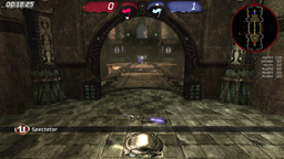
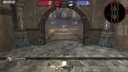
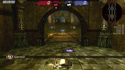

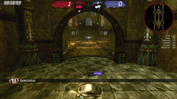

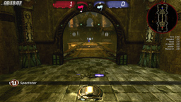
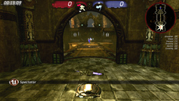
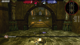
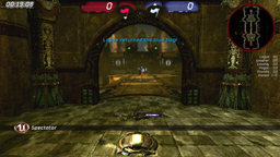
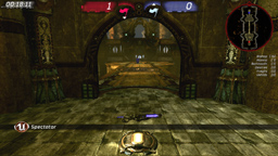
And now for a comparison of the three settings on different maps:
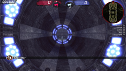
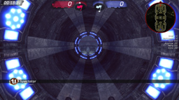
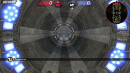
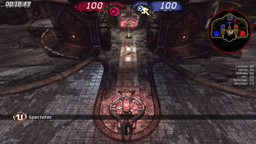
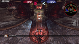
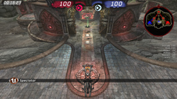
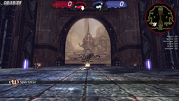
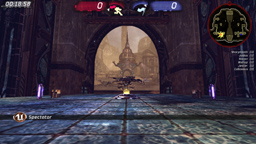
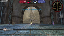
Now for a few shots to show just how detailed models really are in the game. Normally you can't see this, because with Bloom it's all blurred out and without it it has no colour.
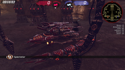
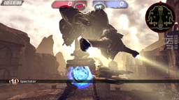
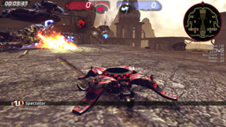
Last but not least - where do you get the mutator? Head over to BeyondUnreal forums and get it!
Good job making this possible, keaukrine! I hope that this mutator gets the publicity it really deserves, because as you can see above, it absolutely rocks and it a most definite must-have for any UT3 player.