Quick links
- Background
- Trying it out and touch friendliness
- Installation
- Interface scaling
- App selection
- Resource consumption
- Conclusion
Background
Starting the round of comparisons between desktop environments (DE) of true Linux distributions is GNOME 3. GNOME is the most popular Linux DE, being the default on Fedora, the majority of enterprise Linux distributions, and soon to become the default on Ubuntu Linux as well. The GNOME philosophy in the later years has been that of increasing polish and cohesiveness in the DE, in expense of (hiding) options.
Now one thing to note is that I have never actually used GNOME 3 before. I used GNOME 2 back in the day, but ever since the (widely criticised) transition to GNOME 3 I had not seen a reason to try it. I am very much a KDE person: configuration is key for me, and GNOME simply does not have what it takes in this area. So I was simply not interested in GNOME 3, when I had a perfectly fine Plasma. However, my experience with the old tablet showed that Plasma is not that great when it comes to touch support. Thus I asked members of the Phoronix forum to suggest a tablet-friendly DE, and the answer I got was GNOME 3. So let’s see what it’s all about!
GNOME is just a DE, provided by a Linux distribution. In order to try out GNOME and have a point of reference, I first ran an Ubuntu GNOME LiveCD. Then I used it to bootstrap a Gentoo installation, which I will later on use to test other DEs and bootstrap the installation of other OSs.
Trying it out and touch friendliness
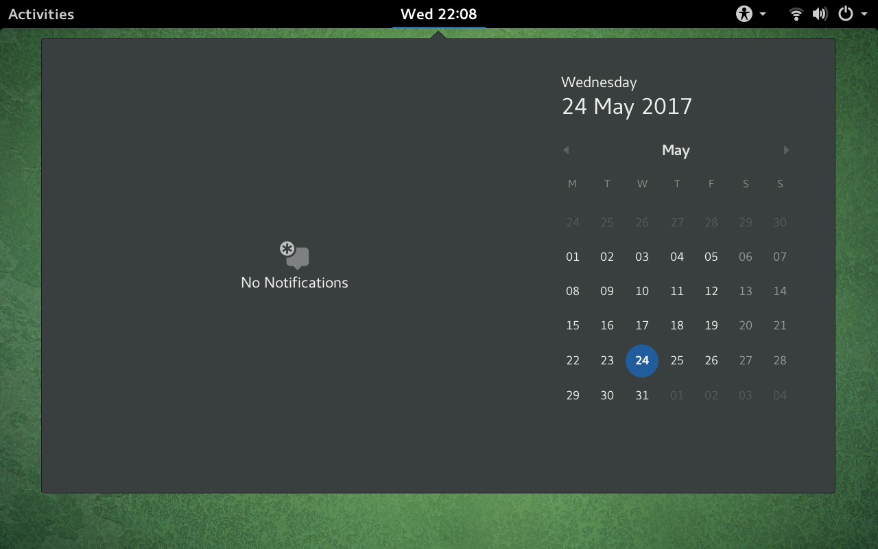
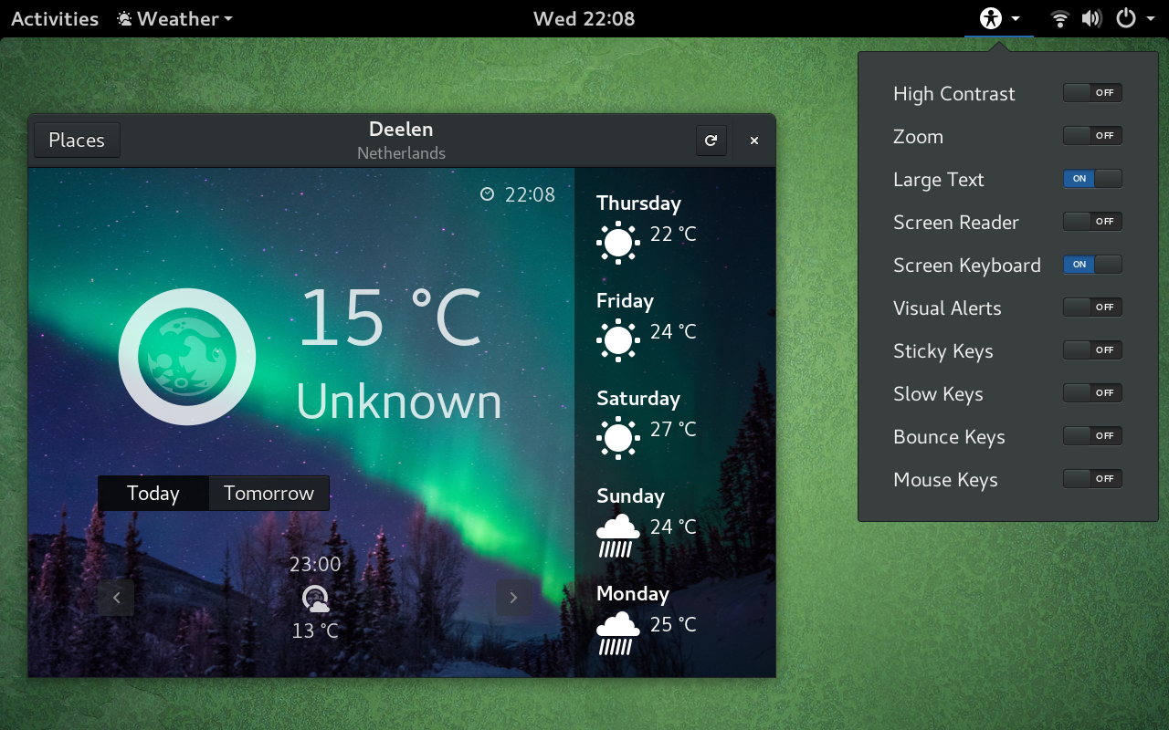
My first impression was quite positive. GNOME pops up the built-in virtual keyboard automatically in the login manager (GDM) and for GTK textboxes, and has an option to call it from the universal access menu. I found that adequate for my uses so far (what with my device being a detachable). The desktop is by default clean and empty, and there’s an obvious “Activities” button at the top left corner, which, when pressed, opens the dash. I eventually figured out that swiping from the left also opens it.
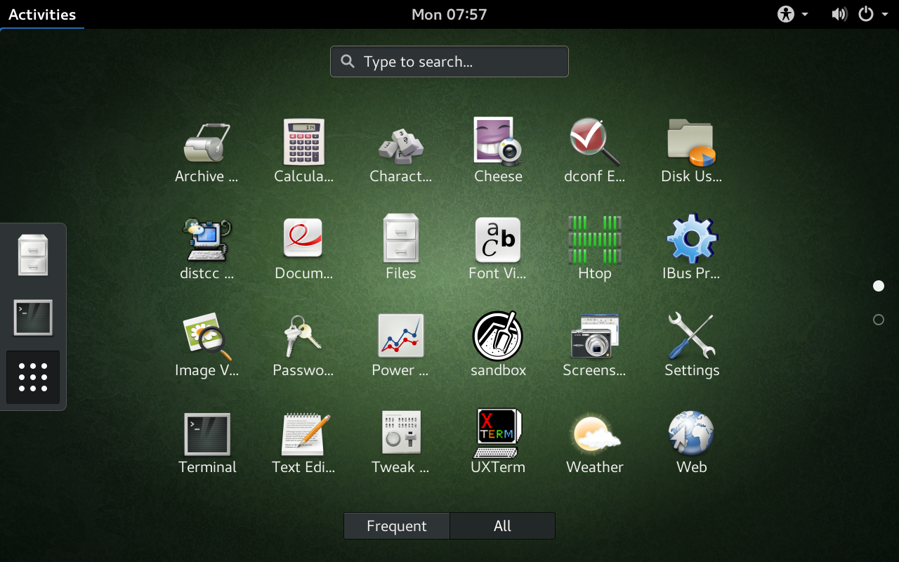
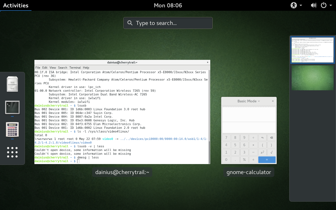
The dash is very similar to what you find in Android: a grid of program icons. It has a tab for most often used programs and a tab for all installed ones. The dash also lists all open windows (if there are any) and allows switching between them, as well as between workspaces. Everything works nicely with drag-and-drop. In fact, it was surprising to me how similar the GNOME experience is to Windows 10 tablet mode: same swipe-from-left-to-switch-windows paradigm, program icons hidden by default (but accessible via the dash, rather than just outright hidden as on Windows 10), fullscreen start that acts as a list of program icons… The only difference is that programs are not started maximised. There are no minimise and maximise buttons, but on a tablet those are not needed (swiping the window decoration to the top maximises).
All the GNOME menus and lists are navigable by swiping, and overall support for touch input is very good. There’s even hold-to-rightclick functionality on the desktop and in the dash. So overall I was positively surprised by GNOME, as it is definitely on par with Windows 10 in this regard. I’ll cover individual apps later on.
One thing that I was expecting, but nevertheless was disappointed by, is the configuration options. GNOME Settings (the control panel) is just devoid of what its name suggests it should have. It has a lot of icons for settings categories, but pressing them reveals just one or two options to change per category, most of which are non-essential.
Installation
My distribution of choice for this tablet is Gentoo Linux, which is by far not a standard distribution, since it works on the principle that you compile everything yourself. This takes a lot of time, but the result is optimised for your hardware and you can pick and choose what functionality to enable at build time, thus limiting dependencies and conserving disk space. But most importantly, I chose Gentoo Linux because I need several things built from source, and unlike in other distributions, this is standard in Gentoo.
Linux kernel
One of those things I needed to build from source is the Linux kernel itself. That is the piece of software that contains all the device drivers, and it is crucial to get it right. For new hardware, such as my tablet, it is also very important to have the ability to freely build it and apply patches. For instance, the kernel bug tracker has a patch for detecting the sound chip of my tablet. Sound thus did not work in Ubuntu GNOME due to the lack of this patch, but Gentoo has user patch functionality that allows applying arbitrary patches by simply putting them in a correct location (/usr/portage/patches/category/package/). Gentoo also maintains a patchset for the kernel that allows preemptively select several options that are required by init systems, so as to avoid a suboptimal system after boot. In general, Gentoo is basically Linux from scratch; there is no installer, the user themselves is the installer! The one major difference, however, is that it has a package manager called Portage that automates download, compilation, installation and dependency tracking for you. For instance, it keeps track of all current Linux kernel versions and downloads them on demand. The current (~arch, AKA unstable) kernel version at the time was 4.11.1.
For reference, I streamed most of the Gentoo installation process and recorded it on my YouTube channel for anyone interested in any particular part of it.
When it comes to the kernel, here is a list of things that worked fine in vanilla kernel 4.11.1:
- Graphics, including backlight levels and turning off the screen
- Wireless (after installing the firmware for the
iwlwifidriver) - Touch input, keyboard
- Sound (but required adding a UCM config file and
aplay -Dto initialise) - Front camera
- Bluetooth (at least seemingly; I don’t really have anything to test it on)
- AC adapter connection detection
- USB, SD cards
- Volume up/down buttons (requires the button_array kernel driver)
What did not work properly:
- Battery level detection Update: works now with the patch in the bug tracker.
- Back camera
- Accelerometer (screen rotation detection) Update: Works now, I was probably just missing some kernel module.
And suspend/resume support was… rather strange: it worked fine in Ubuntu GNOME (kernel 4.10), but not on kernel 4.11 (where it would wake on suspend immediately). So it’s either some kernel config option I’m missing or a regression; one way or another, I will try and bisect later. Update: It seems to work fine in kernel 4.12 now.
I was told to try the linux-sunxi kernel that has staging fixes for the Cherry Trail platform to see if any of those issues are fixed (it’s based on kernel 4.12 RC). I did so, and indeed the accelerometer support is now there and fully working! I can rotate the screen fine with this kernel. There are also fewer warnings during boot. And it doesn’t automatically wake from suspend… in fact it doesn’t wake at all. And battery and camera are still not detected. All in all, that’s really just first world problems though, the system is quite usable as-is (if one is mindful about the battery level in order not to lose data).
Base system and GNOME
I used the systemd Stage 3 archive, and switched to the nomultilib profile, since I don’t plan on running any software that is not amd64. I also updated to GCC 6 and the latest non-hardmasked (AKA very unstable) glibc and binutils, so that I could make use of distcc with my desktop computer helping to compile software for the tablet. The versions still don’t match exactly, so it’s not 100% reliable, but still useful nonetheless. For the bootloader, I simply used systemd-boot (former Gummiboot), since I will want to reuse the same kernel I compiled and known to work for several OSs, which would confuse GRUB.
Then, in order to test that the graphics work, I emerged (that’s how Portage calls installing packages) Weston. The reason is that I realised that I don’t really need Xorg: GNOME now defaults to Wayland, whereas Plasma Mobile supports Wayland exclusively. Sailfish OS also uses Wayland. Weston ran fine, I played around with the demos in it a bit and even created an RDP session (remote desktop) to show it on stream.
Next, I emerged gnome-light, which is the minimalistic GNOME package (includes GNOME Shell, GNOME terminal and Nautilus). I checked the list of core and extra GNOME apps, but decided to emerge only those that might possibly be useful (not much call for a CD burner on a tablet, after all). I also installed the GNOME tweak tool and DConf editor.
Interface scaling
Interface scaling on GNOME is a very interesting beast, since there are 2-3 ways to scale it. By default GNOME scales the interface automatically if it detects at least 192 (2x) PPI and at least 4K resolution. My tablet meets neither of the two criteria: it’s 144 PPI and is 1280×800. I lieu of that, one needs to use the GNOME tweak tool and/or the DConf editor (not GNOME settings!) to force some sort of scaling.
The traditional scaling approach is to increase the font size by multiplication with a given number (in my case, 1.5). This also scales GUI elements with text inside so as not to clip them. This generally works well… for text. Unfortunately, there are a lot of non-text elements too, most notably the close window button, the options buttons in apps, slider widgets, checkboxes, etc. The problem isn’t that the elements are too small to see; it’s not a big deal to hold the tablet closer (though a bit of a bigger deal when the keyboard is attached). The real problem is touch input: with items so small, it becomes very hard to press buttons and increases the risk of misclicking.
The second, newer scaling option is interface scaling, which actually scales everything up. That sounds just like what we need… except that it only scales by integer values. You can scale everything two times, three times, etc., yet not 1.5 times which is what I actually need. In other words, with no scaling everything is hilariously tiny; with 2× scaling, everything is hilariously huge. Now, to be fair, apparently the Wayland protocol does not define scaling by non-integer values, and GNOME developers are just now organising an event to implement fractional scaling, so it’s all a work in progress.
An interesting option was to try and combine the two scaling types by setting interface scaling to 2× and font scaling to 0.75×. That makes it usable again, but it still carries the same but opposite problems of the first approach: text is fine, but elements such as buttons and sliders are huge. It wouldn’t be that much of a problem, but the 1280×800 resolution when scaled up 2× becomes effectively 640×400. That’s not a whole lot of space! The widgets just take up too much space, and for instance the Dconf editor becomes next to impossible to use since it simply doesn’t fit any more.
Another option, suggested on the Arch wiki (but working only on Xorg at the moment) is to make use of xrandr to scale the screen down. the way it works is that the screen is set to 2× scaling, but virtually the render surface is set to be 1.5× larger (so it renders 1920×1200 pixels) and then scales down to real pixels. Effectively it’s a variant of supersampling. That certainly works, but at the cost of increasing the number of pixels rendered 2.25 times, plus scaling overhead! The Intel HD GPU is not really cut for that job and the performance suffers. Besides, I don’t really want to use Xorg.
So in the end I decided to stay with the very first option. Buttons are small, but at least they don’t take much valuable screen space.
App selection
Since Gentoo is a Linux distribution, it is able to run all of the Linux software. Its building from source paradigm allows installing any Linux software as long as the source code is available, by use of simple ebuild scripts. Wine is also available for running Windows software.
GNOME apps
But when it comes to GNOME, it’s a desktop environment because it has a suite of applications on its own. These applications are meant for tight integration with the GNOME environment and adhere to the GNOME Human Interface Guidelines. This means that you get option menus in client-side decorations (CSD), consistent toolbar icons, global program menu displayed in the top bar, clean design and, of course, the very minimum of customisation options. It also means that these applications stand out like a sore thumb when run outside of GNOME (either appearing with a double window decoration or altogether looking way different from regular applications due to CSD). But that’s not an issue as long as you run GNOME, of course.
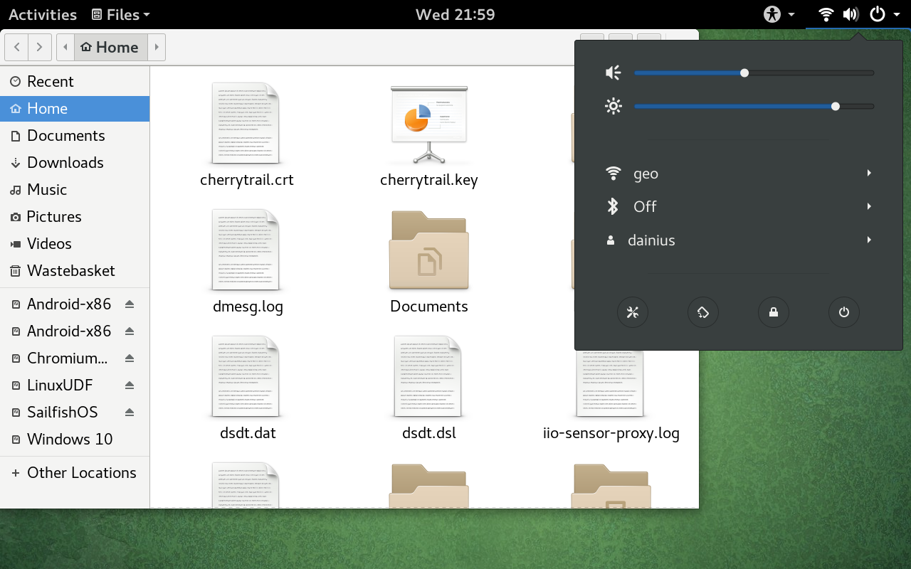
The two core applications are Nautilus (GNOME Files) and the GNOME Terminal. GNOME is rather unusual in that it mounts every partition it can find, so I end up having a whole bunch of them displayed in Nautilus (and it’s rather bad practice, since you risk data corruption on power loss for all partitions rather than the ones you mounted specifically). Nautilus itself is overall fine for touch, although when tested it had a bug where clicking on blank space beside icons would cause a selection of every icon in a rectangle from that point to wherever the location of the mouse pointer is (the top-left corner of Nautilus if mouse is not plugged in/moved), thus preventing from causing a right-click event, without which there is no way of creating new files and directories. The sidebar also reveals one problem of GNOME: the scrollbars are hidden by default until scrolling happens. Which, with touch input, is a chicken-and-egg problem. The sidebar really doesn’t want to scroll with touch input, but randomly every ~10th attempt it does scroll instead of opening the directory under the touch origin. Which causes the scrollbar to appear and further scrolling to be easier… that is, if you can hit the 1-pixel-sized scrollbar, and only until you wait long enough for it to disappear again. Sigh. But at least the main view scrolls with touch fine. Meanwhile, GNOME Terminal is a really basic terminal emulator, nothing much to say aside from that it defaults to opening new windows rather than tabs and to showing the menu bar rather than using the top bar.
The GNOME image viewer is Eye of GNOME. It is well optimised for touch, allowing to move from one image to another by using flicks. The sidebar (enabled by default) is sometimes too keen to resize itself when trying to go to another image, though. And I couldn’t figure out how to exit fullscreen mode without a keyboard. Same with Gedit, the GNOME text editor. However, it is touch-friendly in that it allows selecting text by dragging selection indicators.
Then there are a bunch of extra applications. GNOME Characters, the character map application, seems to be unusually well-suited for touch input. Probably due to having been designed rather recently and there being around two older alternatives to it on GNOME. Cheese is a basic camera app that allows applying amusing filter effects on the fly. Babobab is a disk usage monitor, which can create cool graphs (not quite fsn 3D graphs, but still funky star chart types). However, it’s not very touch-friendly, as navigating the tree view requires you to press the expand/collapse button… which is tiny in comparison.
So all in all GNOME applications are a mixed bag, but they all in some form or another take touch into account. The compact menus also help conserve vertical screen space.
Speaking of vertical screen space: after using GNOME for a longer time, I wanted to put the top bar on the left or right, so that I would have more vertical space, but… There’s no option for that, anywhere. Apparently it’s impossible without addons. And, curiously, there seemed to be no suspend button. Searching around I found out that the suspend button appears while holding the Alt button… and good luck holding that on a tablet without a keyboard! The latest gripe of mine is that even though the accelerometer works and the screen gets rotated, the touch events… don’t. In other words, the top bar moves to what is the new top when rotated clockwise to portrait mode, but in order to use it, you still need to press the area on the new right! Windows that you try to move up end up moving right, and vice versa. It’s not really usable that way. Still, it’s all minor issues and bugs that I’m sure will be solved in time.
Web browsers
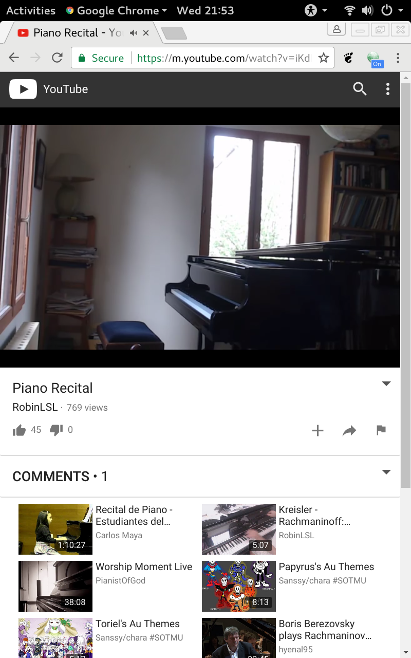
Web browsers deserve their own space, because web browsing is one of the key activities of modern computing, and the experience is wholly dependent on how touch-friendly the browser is. The GNOME Web browser is Epiphany, a GTK Webkit browser. It is a decent start: it allows scrolling by drag and pinch-to-zoom. That’s quite useful given that web pages by default display real tiny due to DPI settings. However, it also supports pinch-to-zoom-out… and no easy way to get back to 100% zoom level. It doesn’t lock to 100%. Also, I found no way to select text with it at all. And, of course, being a GTK Webkit browser, it does not support some of the more sophisticated technologies such as WebRTC and DASH. It also had poor performance, especially in JavaScript-heavy websites like YouTube.
Given that, I figured I’d try out some more web browsers. In the past, even on Windows touch-friendly browsers were a rarity, so it’s already impressive that Epiphany managed to achieve decent results. The two major browsers are Firefox and Chrome, so I decided to see how they compare (and I had read that they have touch support). First, I installed firefox-bin. But after I launched it, I saw a problem immediately… I couldn’t scroll. Text gets selected instead, like on a desktop. And no pinch-to-zoom. I looked at about:config, but all relevant settings seemed to be enabled by default already. I asked the developers on the Firefox IRC channel, and they said that hardly anything was done for touch support on Windows, never mind Linux… Welp.
I emerged google-chrome with some more doubts, especially since I’ve read that some people had problems with it activating touch support too, necessitaing some launch options to be set. However, turns out I was worried for nothing: Google Chome delivered. The experience out-of-the-box is very comparable to Chrome for Android: excellent scrolling, pinch-to-zoom, JavaScript performance. I was really impressed that it even picked up on the tablet’s PPI! All elements were at 150% size, and the screen size reported to websites was 853×533. The only problem in Google Chrome that I encountered is that even though I can start selecting text, the selection handles don’t seem to work properly, as trying to drag them results in a deselection. So while I can select individual words, it’s of limited use. Update: This seems to be an issue of Chrome on Wayland; it works properly on Xorg.
While the Android version of Google Chrome has the option “request desktop version”, the desktop version, well, doesn’t have a “request mobile version” option. I figured I’d look at what can be done about that, because at this resolution, desktop websites don’t really look nice (and mobile sites are often better optimised for scrolling by dragging). Research showed that the way that the request site version option works is in fact… user agent string manipulation. Weeelp. Suddenly, I’m losing my faith in humanity again: after all this time, nobody has come up with a way to just query the browser’s preferences, and all websites have to rely on parsing inherently broken user agent strings?! Aaargh! But, sure enough, making the browser pretend it’s running on a Nexus device makes mobile website versions appear (technically, just adding the word Mobile anywhere in the user agent should do the trick too).
Resource consumption
The boot time as reported by systemd-analyze is 2.72 seconds for the firmware (agrees completely with what Windows 10 reported), 2.40 seconds for the kernel and 4.75 seconds for the userspace. That’s 7.15 seconds to boot into GDM, which is almost on par with Windows 10. It takes 9.2 seconds more to get to the GNOME Wayland desktop.
The memory consumption with nothing but the terminal open is 425 MiB, with 364 MiB cached. This is lowest memory consumption yet, and GNOME isn’t even known to be optimised for low memory consumption!
The disk usage is a fairly complex subject. For the very base GNOME (gnome-light package), the total disk space occupied was at around 5 GiB. Of these, 800 MB is taken up by the Portage tree itself, 700 MiB was taken by downloaded temporary files for building (distfiles) and further 1.2 GB is taken up by the Linux kernel sources. Libraries take up around 1.1 GB (215 MB system libraries, 127 MB libexec, around 800 MiB user libraries), program files (/usr/share) take up around 700 MiB (of which, most are help files), binaries take 120 MiB, development headers another 119 MB. Thus a more fair estimate of actually used disk space would be around 4.1 GB. With GNOME apps installed, user libraries take up 926 MB, program files 781 MB, so it’s around 4.4 GB total. And after installing sources for the linux-sunxi kernel as well as two web browsers, plus extra downloaded files (1.2 GB of those in total), the brutto disk space consumption is 8.2 GB (= 7.7 GiB). That’s still just half of what Windows 10 takes, though over twice what Remix OS takes.
Conclusion
All in all I’m positively surprised by GNOME; it’s certainly the most touch-friendly free software DE I’ve seen so far. But then we’ll see how that compares to Plasma Mobile in the next review!
The good:
- Touch-friendliness
- Application compatibility
- Free software
- Clean, compact design
The bad:
- No good scaling options yet
- Some obvious bugs
- Relatively few customisation options out of the box
